


Welcome to The World of Stamp Exhibiting!
by Tom Fortunato
Preface
The following articles appeared in the Junior Philatelists of America's publication, The Philatelic Observer, from 1994 to 1997. Exhibiting basics outlined here are for exhibitors of any age and should be especially helpful to those who have been tempted but never actually taken the plunge. Detailed are simple instructions about getting started and progressing through local, regional and national competition. While not everyone is potentially interested in reaching the highest ranks of the philatelic exhibiting world, the rules which guide the hobby are fairly consistent at every level. I hope you will find this information helpful.
Why Exhibit?
Despite our best efforts, the number of collectors (including youngsters) exhibiting at the 34 national-level stamp shows around the country seems to be declining.
Why is that? Why aren't you exhibiting? Perhaps you feel that the stamps and philatelic material you have aren't good enough to exhibit. Nothing could be farther from the truth! You may not (and should not) start at a national level show, but at least get started at a local or regional exhibition. Every exhibitor has to start somewhere and get his or her feet wet!
As time passes, you'll find better material to replace the more common items you begin with. Be patient, as this does take time!
Perhaps you don't "know the rules." The best place to start is with a copy of the actual guidelines that the judges use when giving awards to exhibits. It will give you an idea of what a judge looks for and what you should think about, too. Here in the USA, a rules book can be purchased through the American Philatelic Society at P.O. Box 8000, State College, PA 16803, or phoning (814) 237-3803.
You could just be a little scared too! Few want to enter a world you know nothing about. Believe me, not everyone has a mentor to show them the ropes helping to show what to and what not to do. But there are many experienced exhibitors out there willing to lend a hand if only asked.
This primer on exhibiting for young or old is meant to at least tempt you to get started. It's not as hard as you might think. Read on and see how easy it can really be. You are also welcome to contact me with your questions and comments.
A Philatelic Elements Shopping List
Here is a very useful checklist that can serve as a basis for acquiring material for your exhibit. It will help you obtain the variety of material you need . Even the experienced exhibitor can refresh their knowledge by reviewing these definitions.
Using this checklist will not only enable you to exhibit your subject with a good variety of material, but it will also introduce you to some new and challenging philatelic areas. Later, your checklist can be adapted to determine which elements you can use. While topical/thematic exhibits use these elements extensively, all exhibits show some of them.
Essays are trial designs for a stamp unlike the final accepted work in some way- major or minor. Oftentimes, several designers are asked to send in sketches of their proposals. Those not selected remain as essays. In fact, even the accepted design may become an essay if additional changes are made to it before production.
Proofs are a test printings of a stamp from an original plate or die.
Trial colors are a test of the stamp design printed in different colors to find out which are the best colors to use. Trial colors are types of proofs.
Specimens are final examples of approved regularly issued stamps but without postal validity. At the turn of the century it was common for countries to issue specimens as examples for other countries to view as acceptable and valid stamps. Such would have "Specimen" overprinted on them, or perforated into the design to stop people from using them in the mail. Specimens continue into this day primarily for journalist use. They are overprinted in a variety of ways.
Printing varieties entail an assortment of possibilities. Paper varieties are just that- stamps issued on different paper varieties. Perforation varieties are stamps issues that through the production process are found with different perfs. Watermark varieties are symbols in the stamp paper that can be seen where the paper is slightly thinner. Sometimes paper having a different watermark were used to produce stamps, intentionally or not.
Production formats are important. It's good to show not only single stamps, but pairs and blocks if they are significant, including any with special production salvage markings on them.
Coils are stamps produced for vending machines or ease of use.
Booklets are another production format.
Miniature Sheets contain multiple stamps mostly with the same design.
Souvenir Sheets are similar to a miniature sheet but imply some form of commemorative inscription in the sheet margin.
Panes are typically the sheet form found in a post office. Then there are complete sheets as printed at the printers.
Stamp types include
Definitives (used for a prolonged period of time),
Commemoratives (having a short usage),
semi-postals (with regular postal value and a tax for a worthy cause),
Postage Dues, and
Revenues (exclusively to denote a tax paid);
There are more types as well, but these are the most common.
Postal stationery are specially made envelopes, post cards or letter forms for use in the mail with postal value.
Aerograms are thin paper letter forms used for international mail.
Envelopes and Postal Cards look as you would expect, but have a prepaid indicia on them denoting their postal value. Also in this category are wrappers, commonly used for mailing newspapers and pamphlets.
Cancellations and Postmarks are found on covers and other postal documents. Common types are machine, hand, and pictorial. These explain in what manner they were applied or their intent.
Backstamps are routing cancellation marks applied to the reverse of a cover showing where and when a letter passed through postal handling.
Don't overlook meters. These are common today, especially on bulk and commercial mailings. Several companies around the world make meter machines, and their types and history are fascinating.
When it comes to Covers (envelopes or similar wrappings which carried mail), those postally used and non-philatelic in origin are best.
Censored Covers are mail pieces which were opened for inspection.
Always look for Auxiliary Markings which denote special handling, delays, etc. Whenever possible, explain the route a cover may have taken from origin to destination.
A maximum card is a post card bearing a stamp cancelled on the picture side. Ideally, the stamp used, cancellation and picture post card should all be related by topic in some way.
This is just a short list of the possibilities!
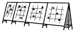
One Page Exhibiting- A Simple Start
Who said that you need to enter a contest to consider yourself an exhibitor? Here's a challenge to each and every one of you with a fun project that you will be proud of.
Can you make up a one page exhibit on a subject of interest to you? It's easy. First, go out and buy an inexpensive picture frame. The size is up to you, but an 11x14 or 12x16 works best. Make sure that you have enough philatelic material to fill up the frame size that you buy.
What you put in it is totally up to you, but using at least one cover or piece of postal stationery would be best, as well as a good number of stamps, mint or used. Then arrange the items in a pleasing way on a white or colored background paper the same size as your frame. You may wish to place the cover in the center and have stamps around it. In any case, remember to spread the stamps out evenly, giving a balanced look to the page and attach your items neatly using hinges or mounts. Slip it into the frame and presto!
When you're done, you have a personalized one page (or should that be one-frame?) exhibit good enough to hang in your room. Ask your friends or relatives to "judge" your display and decide what level award to give it; gold, silver or bronze.
It's that simple, and a real fun time for everyone. These make great gifts, too! Now you don't have any excuse for not taking the next step, getting into real exhibiting. Read on to learn more!
Exhibit Categories
This article briefly lists some of the many exhibit categories recognized by the American Philatelic Society and the FIP (International Philatelic Foundation). Once you've decided what you wish to exhibit, find the category that best suits your intent.
Traditional: explores all aspects of a single stamp or a series of stamps, including essays, proofs, printing methods, configurations (singles, blocks, plate positions, etc.), varieties, errors and uses on covers.
Postal History: deals with covers and the routes and rates used during a particular time period.
Thematic: topical exhibit telling a story through the use of worldwide philatelic material covering a variety of elements spanning all eras.
Postal Stationery: similar to Traditional but focussing on postal cards, envelopes, aerograms, wrappers and other stationery.
Aerophilately: everything about airmail stamps, their uses, routes and rates.
Revenues: stamps, stamped paper, etc. used in any fashion to collect taxes or revenue.
Special Studies: a thematic study using philatelic material but not adhering to a strict diversity of thematic elements.Youth: a separate category for collectors up to age 18. It can be in any of the above areas, but is usually judged in two divisions: thematic and non-thematic. A sliding point system is used for determining awards depending on the division entered and age of the exhibitor.
One Frame: a display of philatelic material confined to a complete study within 16 pages.
Display Class: a blending of philatelic and non-philatelic items which tells a story.
The Importance of a Title and Plan Page
I've just returned from spending two weeks at Pacific 97 and had just a wonderful time. Of course, I had my eyes on the exhibits! There were some exceptional displays, and some which just didn't deliver what was promised. Here's a reminder about the all-important title and plan page.
The title page is the one page in your exhibit where you can be as creative as you like, but given a choice between artwork and a nice philatelic item, put in the item. Be very specific with the title. It's expected to have your title prominently displayed in bold lettering, followed by a brief few sentences of what you will be showing and why. Never put your name on this page! Remember that this is the first page of your exhibit, and leave the best impression possible with it.
The plan page (used mostly for topical exhibits) should look like the chapters of a book. Each chapter is then divided into subcategories on the plan page.
For each exhibit page, list the chapter name in the upper left, and the sub-chapter description on the upper right. This allows the viewers (and judges) a clear understanding of what will be seen below.
Coming up with these chapters and sub-chapters will be a big challenge, but when done well will outline the whole story of your exhibit from start to finish.
Exhibit Plan Page Numbering
Is there a correct way to number the plan page of an exhibit? The plan page is one of the most important pages, detailing for the viewers and the judges what you are showing. The numbering system used is also to be followed on your exhibit pages, so a logical sequence is a must. While there are many ways to do this, one system is recognized as being the most widely accepted approach.
An example is found below that closely resembles the numbering system found in the library. Major headings are followed by one or two smaller subheadings. The plan page should list these vertically:
The Olympics
1 Winter Sports
1.1 Skating sports
1.1.1 Figure skating
1.1.2 Ice dancing
1.2 Skiing sports
1.2.1 Ski jumping
1.2.2 Cross country
2 Summer Sports
2.1 Team Sports
2.1.1 Baseball
2.1.2 Basketball
2.2 Individual sports
2.2.1 Boxing
2.2.2 Wrestling
It's also a good idea to list the total number of pages displayed for each subheading as well. Your page headings will resemble the outline. For example, one of the page headings should read:
2.1 Team Sports- .2 Basketball
A similar heading should be used throughout the exhibit, giving it a uniform look. That's all there is to it!
Elements of a Cover... Take a Closer Look!
Covers are important to every exhibit. Judges will especially reward you for showing unusual covers which tell a story, and they needn't be expensive.
The most commonly found cover is a first day cover (FDC). You probably have some in your own collection. Philatelic bureaus, companies and individuals produce them with a design on the left side of an envelope displaying a design relating to the stamp. This design is known as the cachet (pronounced ca-shay) and often times is quite detailed and colorful. Use them very sparingly, if at all, in your exhibit.
A better cover is a non-philatelic one, also known as a commercial cover. These show actual usage of the stamp on an envelope mailed at the proper postage rate. You and your family make these up every week with letters posted to a relative or when a bill is mailed. While these covers aren't as flashy as a FDC, they are much harder to find covering a specific topic, especially foreign ones.
You can "top" a singly franked cover with one showing multiple copies of the stamp you wish to highlight in a strip or block. Heavier envelopes weighing more than a regular letter or ones needing special services like insurance, certification or registration are a good source for these, or those going overseas. Avoid mixed-franked covers which have too many stamps not of the type you are writing about.
Auxiliary markings are great finds on covers, adding interest and philatelic elements to your display. Any marking applied by a post office falls into this category. A redirected cover has the original mailing address crossed off and a new one hand written or labeled over by a postal worker. Be on the lookout, too, for "fingers", markings that point to the sender's address with comments like return to sender, undeliverable, etc.
Backstamps are postal routing markings found on the back of some covers, showing a location where the mail passed through or its final destination. Registered covers always have these types of markings and should be noted in your write-up. If multiple backstamps are shown, list them (city and date) in order of their date.
Don't neglect the cancel on the front of a cover! It should "tie" the stamp to the envelope. If the stamp missed the cancel, don't bother showing the cover, as it could easily be faked! Occasionally you can mention if the cancel used was done by hand or machine, as there are several types of each. Pictorial cancels, almost always hand stamped, are easy to recognize because of their interesting designs.
I hope this brief look at covers will get you to examine them more closely from now on and don't forget to give them a proper write-up when exhibiting. Some of my best finds have come out of dealer's junk boxes and my own mail!
Fun With Watermarks
Too often we only look at the front of a stamp, totally neglecting the other side! You may miss entirely the stamp's watermark, if there is one.
Watermarks are older than stamps themselves, used first hundreds of years ago as a security measure to prevent fraud. They are created when the paper itself is made. Paper pulp runs under a device called a "dandy roll," a cylinder with fine wires around it in a specific pattern. When dried, the paper is thinner in the sections which were depressed in the moist pulp.
 This thinned section leaves a design that can be seen when the stamp is held up to a light or placed in a watermark tray with a few drops of watermark fluid. Even well seasoned collectors are unaware of the variety of designs found in the watermarks of the world. Topical collectors should also take note, as this adds another element when exhibiting.
Here are a few examples of what can be found. Give yourself a challenge and see how many you can locate in your stamp catalog, but beware, it's going to be tough!
Some Common FAQs (Frequently Asked Questions)
Will judges dock me if I show mostly used stamps in my exhibit?
Your long term goal is to display either all mint or all used stamps, along with other philatelic items. Absolute adherence to this rule is expected at national or international competitions. However, at lower levels, judges will understand if you mix mint and used. Some very inexpensive stamps are difficult to find in mint condition, despite the myth that all mint stamps are expensive. As for used stamps, postally used are preferred rather than cancelled to order stamps- those with a printed cancel on them.
How important is it to have variety in a thematic/topical exhibit?
The best exhibits use a great variety of philatelic "elements." Displaying an assortment of items, such as stamps, cancels, covers, postal stationery, booklets, etc. helps to show your philatelic knowledge. Once you have these, the next challenge is to mix them so that at least two to three elements appear on each page. The better your variety, the more points you will score in that category.
Sometimes covers are exhibited with their address hidden. Why?
As exhibitors, we often write away for examples of special postmarks, or friends mail them to us. At one time, exhibitors using covers which had their own name and address on them were forced to hide them. Judges are never supposed to have any clues as to whose exhibit they are looking at, and it was thought that hiding addresses would accomplish this. The "hide" rule is no longer enforced, but some exhibitors continue to cover their addresses for security reasons.
Page Balancing
 Almost everyone including world class exhibitors, can improve on page balance. The ideal exhibit page is one that looks symmetrical if "split" in your mind. Here are a couple of simple tests to follow:
1. The "pie" test: Think of each page as a pie cut into eight equal pieces. Do most pieces have an equal amount of "filling" (your philatelic items) and "shell/crust" (your write-up and non-covered page)?
2. The "grocery bag" test: Pretend each of your stamps, etc. is going into a grocery bag at the supermarket. Heavier items should go on the bottom, lighter ones on top. In general, this means to place larger items (especially covers) on the bottom of a page and smaller ones (single stamps, etc.) towards the top.
All of this is much easier said than done and there are no absolute "right" ways of doing it. But follow these simple thoughts and you will be well on your way to exhibiting like a pro!
Mounting Your Exhibit
One of my biggest pet peeves when judging is the way exhibits are mounted. Presentation doesn't count for many points overall, but if done incorrectly it makes a bad first impression.
First off, use white or very lightly colored paper. Too strong a color will detract from the stamps and philatelic items you're showing. It's best to find a heavier grade of paper rather than just a 25 pound weight typically used for copier paper. If you try lighter paper, your pages will droop from the items placed on the page, so I'd suggest a 67 pound card stock, easily found in a stationery or office supply shop. You may prefer to use pages with ruled quadrille lines or light gray dots on them to assist in mounting. Just make sure that these do not overpower the overall page appearance.
As an exhibitor, you have several options. For a display of all used stamps, simply use hinges. Should you have a mix of mint and used stamps, or all mint stamps, consider using Scott Mounts or a similar product. Stamp mounts are plastic looking foils of various heights, split on one side to allow for easy entry of your stamps. They have adhesive on the reverse so that they can be attached to the page. Know that they come in two major types- with a black or clear backing.
Most stamp dealers only carry the black version. The black mounts may look better by "framing" your stamp in a dark background, but beware! Use the mount with the right height or the "frame" will be top heavy and look terrible. Cut these mounts very carefully and straight as well. Whenever possible, use the clear backed mounts instead of the black variety. They have several advantages. If you don't have the right sized mounts available, the clear ones will not look as out of place as the black ones.
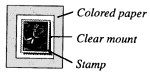 You also have an option of making your own "frame" for each mount if you use the right sized mount. Cut a piece of colored or construction paper (a lighter shade works best) which is slightly larger than the mount by an eighth of an inch or so. Always be sure to cut straight! Glue the colored paper to its position on your page, then place the mount on top of the colored paper. The result will look great against the white page.
By the way, this technique also works well if you hinge used stamps right on the colored paper cut to size. You can do the same for covers, using corner mounts.Covers and larger philatelic items pose another problem for mounting. Large, clear corner mounts work best. You can find these in most photo shops. It's not necessary to use a mount in each corner if you don't want to. If you're showing the entire cover, put them on opposite corners, in the upper left and lower right, away from the stamps and/or postmarks. A glue stick can come in handy, as these corners are reusable when you redesign a page and remount the exhibit.
Windowing
Windowing is a technique used by exhibitors to hide a portion of a cover. Many times you will want to focus the viewer's eye on the stamp and/or postmark, rather than a cachet or irrelevant part of an envelope. One of these three windowing procedures will help you, so give them a try! All you need is a cover, a ruler, scissors, a pencil and full size sheet of paper to practice on.
Let's start with a "slit." This is used when you want to show only the right side of a cover. First, measure the width of your cover. Draw a vertical line equal to the measured width in the center of the paper. Cut along the line and slide the cover through the slit, allowing only a portion of the right side of the cover to show through. A slit is good to use when hiding a cachet, for example.
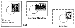 Next is a "corner window," which will hide every part of the cover except for its upper right corner. Measure the length and width of the corner which you want displayed. Draw those dimensions in the shape of the letter "L" where you want it on the page, with the corner in the lower left. Cut the lines and slide the cover from behind, exposing only the upper right corner.
Perhaps easiest is a true window. Measure the size of the opening to be exposed, draw it and cut out the square or rectangle. Make sure that the opening leaves an even margin completely around the highlighted item.
No matter which technique you use, your cover needs to be mounted to the page from behind. There's also a chance that your cover will extend beyond the borders of the exhibit page. If so, you will either have to move the window to another part of the page, or fold a portion of the cover. In any case, you must plan ahead and practice, practice, practice!
Sending Your Exhibit Away
What do you do after you've prepared an exhibit? Hopefully you have a local show to display it at. Whether you do or don't, there are hundreds of local, regional and national shows to consider as well.
The first step to take is check show listings in the various stamp newspapers and magazines. Most give dates, mention if exhibits are included or not, and a contact person for further information. Write to those you are interested in and ask for an exhibitor's prospectus, which is a listing of the official rules. Read each carefully. They will all be different. Take special note of the date an exhibit must be received by the organizing committee, any special mailing requirements, and the number of pages per frame.
Be aware that putting all exhibit pages into individual plastic page protectors is usually mandatory. This is a good idea even if you aren't exhibiting them!
Fill out the application with the required fees by the deadline and wait for a confirmation letter.
There is usually a fee charged to exhibitors based on the number of frames you will show. This cost helps pay for a variety of expenses, including the exhibit frames themselves, security guards, awards and judging honoraria. At a national level show, fees can range from $7 to $10 per frame. However, youth exhibit fees are often discounted. Local or regional shows are typically $3-$4 each and sometimes free. Frame fees are requested at the time you submit the application. If a show fills all of their frames and cannot accept your exhibit, your money will be refunded. You will also be required to pay all postage costs to send and receive back you exhibit.
What is the best way to wrap an exhibit up for mailing? Here you have several options. I store my exhibits in a three-ring binder and will often mail the binder and all in a very sturdy box. If you prefer, find a box or cardboard envelope that allows your pages and page protectors to fit snugly inside without moving around. You should include a return address label and return postage as well, unless the show committee requested payment for this instead. No matter which method you use, securely wrap the package to survive the rigors of the Postal Service or mailing company.
The hardest part is left - waiting for your exhibit to return and check out the awards you have won! One final cautionary note. Unless you have a mentor or have exhibited for a while, consider showing only at local or regional shows. National shows have a much higher degree of standards, as are the expectations.
Judging an Exhibit
In this article, I'll share a few points with you about what a judge thinks about when looking through an exhibit. Perhaps it will help you with your own exhibit. Simply put, exhibiting is "show & tell". You are telling a story using stamps and philatelic items which must be clear and concise. There are strict guidelines for judges and exhibitors at the national and international level stamp shows in order to obtain the highest possible medal award. At the local and regional level, the exhibiting committee is free to set their own rules.
The three most popular exhibiting categories include: topicals/thematics; postal history, a study of postal routes and rates; and traditional, all about one stamp or a particular set. Each of these have their own rules and relative point systems, but a judge notes common features among them.
Even though the overall appearance of an exhibit receives relatively few points, it weighs heavily on a judge's mind. A poor looking exhibit may not do well even though it has wonderful material. Handwritten lettering, if done neatly, is to be looked on no differently as one which is typed. Either way, it must be neat, with mounts evenly cut and material placed in a different way on adjoining pages.
Keep the text brief. Avoid long paragraphs. The text must relate directly to the material being shown. For example, you can't talk about a baseball umpire without showing one on a stamp, cancel or cover. Separate the story text from the philatelic text. Many exhibitors do this by putting the story text above and the stamp description below the item being shown.
You will pick up extra points by using unusual, diverse material and explaining your philatelic knowledge about it. No judge can or could ever "know it all", but I enjoy seeing an exhibit that tells me something new or gives me a new viewpoint on a familiar subject.An exhibit must show a logical sequence with a beginning, middle and end. The categories should be evenly divided if possible. The scope of the exhibit should be clearly defined in your title page. Avoid too broad a topic, like "animals". Instead, try picking a particular animal to explore in depth.
As you can see, this article turned out as a "do's" and "don'ts" on exhibiting. So it should, because exhibitors and judges are playing by the same rules, like them or not. Finally, all judges would love to talk to you at the stamp show about your exhibit, but remember, since you can't always be there, the exhibit must do the talking for you.
A Look at a Judge's Scoring Sheet
Let's look at a judge's score sheet for topical/thematic exhibits. The score sheet has three major sections: General Impressions of the collection, Thematic Treatment, and Philatelic Material & Knowledge. Other exhibit types (postal history, etc.) have similar breakdowns but weigh each section differently.
General Impression means just that. The judge will overview your entire exhibit for the following items: title page, plan of collection, subdivisions and arrangement of philatelic material, the setting-off of stamps and philatelic material, neat, clear and brief text, mounting and general eye appeal.
The Title Page must be the first page in your exhibit and it must clearly state what your exhibit is all about. A good tip is to do your title page last even if you have a title in mind. The title page is often the most fun because you can use artwork, greeting cards, postcard pictures, computer graphics, almost anything goes; and as a set rule this is the only page which allows non-philatelic creativity.
The Plan of the collection is often where juniors become confused by judges notes and comments on their sheets. The plan is merely an outline and as you begin to develop as an exhibitor you will include a plan page as the second page in your exhibit. This outline, used as a reference tool, makes it much easier to subdivide and arrange your philatelic material. This plan page can and will affect your scores, between 18-25 points for development, in the Thematic Treatment section.
Subdivision and arrangement of stamps and philatelic material - Each page of an exhibit should have a well rounded mixture of philatelic elements: stamps, covers, cancels, maximum cards, souvenir sheets, postal stationery, meters, etc. Exhibitors should try to have at least two if not three elements on a page. More than this would be ideal.
Arrangement refers to the layout of each page and the "look" when all the pages are put together. A good example is if your exhibit contains only two or three covers. Mix them up! Don't put them on the same page, nor on adjacent pages when possible. This is one of the greatest challenges for an exhibitor.
Setting-off of philatelic material is an often mis-understood category. The stars of any exhibit should be the stamps, covers and other philatelic material. The material you select to show should speak for themselves.
You should always strive for clarity and pertinence of text. Many judges have used the term "telegraphed" when referring to text. This just means to make your statements non-wordy, brief, and concise. Most youth exhibitors (and adults, too!) have a tendency to get very wordy with the descriptive text in their exhibits. Forget it!
General impressions include mounting of materials and general eye appeal. Mount your material with clear mounts, which are preferred by most exhibitors and judges. They may be outlined in black pen, neatly, with a uniformly-sized border. The size of the mounts you use is very important. They can be trimmed to meet your needs. Don't make them over-sized. Eye appeal means exactly that! You'll want to design page layouts with individuality. Avoid them all looking the same.
The Judging Critique
A "critique" is the philatelic term describing the process of reviewing an exhibit, either in person or by mail. As an exhibitor, this is a vital way to learn how to improve your display.
"In person" critiques are best. If you exhibit at a regional or national show, a formal judges' critique is almost always scheduled. This is your opportunity first-hand to hear from the judges why they gave you the award level you received. It takes place in a meeting room away from the frames.
The jury chairman starts off with a few words about the show's exhibits as a whole and then invites exhibitors to ask about their own presentation, starting with the lower level awards. Often, certain judges are assigned specific exhibits to comment on, spending 3-4 minutes on each, then allowing other judges to add their observations. Many times judges will also offer to visit with you afterwards at the frames to give you additional tips for improvements.
Whether you attend in person or not, a written critique also will be sent to you after a show. It breaks down the exhibit into categories such as presentation, material used, philatelic knowledge, and alike. Each will be scored using a point system, with written suggestions to help you. This will not be an in depth review, but general guidelines to help you overall.
A "critique by mail" is another option. You send the 'judge" photocopies of your exhibit pages, either in whole or selected portions. This person will write ideas and comments on each page, mailing them back to you. I'1d be happy to review any exhibit this way. All I ask is that you include return postage and be patient for my reply! Just remember, every judge has their own opinion. You make the final decision as to whether you follow his or her advice or not.
Awards
What awards can you expect to win when you exhibit? While there are standard award levels, special youth awards are available from a number of sources.
National level shows have five basic award levels. From highest to lowest, they are: Gold, Vermeil, Silver, Silver-Bronze and Bronze. Local and regional shows usually leave out the "middle" ones, opting for Gold, Silver and Bronze. Sometimes these are termed First, Second and Third place instead.
A variety of societies also offer specialty awards. Here are just a few of them specifically for those under age 18. Each has their own requirements, and it's advisable to write to them for specifics, including a self-addressed stamped envelope.
American Topical Association - ATA Youth Award. Arlene Crosby, ATA Awards, 1348 Union NE, Grand Rapids, MI 49505.
North American Youth Stamp Exhibiting Competition (available to national level APS shows only). NAYSEC Award, Ada Prill, 130 Trafalgar, Rochester, NY 14619.
International Society of Worldwide Stamp Collectors - ISWSC Youth Merit Award for best display of worldwide stamps. ISWSC Youth Merit Award, 42 Maynard Street, Rochester, NY 14615-2022.
A Stamp Exhibit Evolves
Have you heard the classic joke, "How do you get to Carnegie Hall?" The answer is, "practice, practice, practice." So it is with exhibiting.
When you start thinking about an exhibit, you probably have some thoughts of what you want to show, what's to go on each page and the general flow of the story line. The tough part comes after you've put it all together and shown it for the first time. Your friends, relatives or the judges will all have suggestions on ways to improve it. Then additional material will come your way that you just have to fit into the exhibit somehow. Time to make changes!
It's a never ending process. As you graduate to higher levels of competition, the rules become more restrictive. Material acceptable at a local show, for example, may be (and often is) considered improper at regional, national and international ranks. The same goes for any personal drawings and artwork, or any non-philatelic items, like picture post cards, etc. These are strictly taboo. Remember, this is supposed to be a philatelic exhibit!
You can follow the general guidelines mentioned in the prior articles. Always strive for showing exclusively mint or used stamps in the exhibit. Yes, this can get expensive, but it's financially easier a little at a time. Don't forget that it also takes time to find what you're looking for. No one dealer will have everything you need and many surprises will come your way.
Replace colorful first day covers with commercial usages. While they won't look as pretty, they are appreciated more and add to difficulty of acquisition. Mount your material with clear mounts and avoid the black backed kind. When possible, type the text for your exhibit and keep it as short as necessary to get your point across. Always use a wide variety of philatelic materials, mixing them up on each page. This process can go on for years.
What sets the national and international exhibits apart at all levels is the depth and development shown. Rarer material is expected to be displayed. What might have started off as being a single frame exhibit of 16 pages is expected to be at least 2-3 frames at nationals and 4-10 frames at internationals. The exhibitor should have received a lot of help from experienced philatelist in determining appropriate material and had the flow structure critiqued many times as well.
No matter what level you're exhibiting at now, or if you're just starting to get your feet wet, it will expand your knowledge of all aspects of philately. And best of all, it' s fun!
So remember, "practice makes perfect" when exhibiting!